A note on copyright: Most of the images shown in this post are the work of Donald May and are used with his permission. Other were copied from the public Internet, but despite the fair use provisions of copyright law that allow even copyrighted materials to be displayed for a single time to a limited audience without securing the permission of the copyright holder, it was decided safer to delete them. The reader is encouraged to search the Internet for “religious images” to draw comparisons with the exemplary secular images shown here. —Ed.
Donald: How do we picture God in our minds? As a visual image, or as a word or concept? We are very visual people in this day and age, so probably most of us visualize something. How does visual perception—how do the images of God in our minds—influence our understanding of God?
Figure 1 is typically how we visualize Christ:
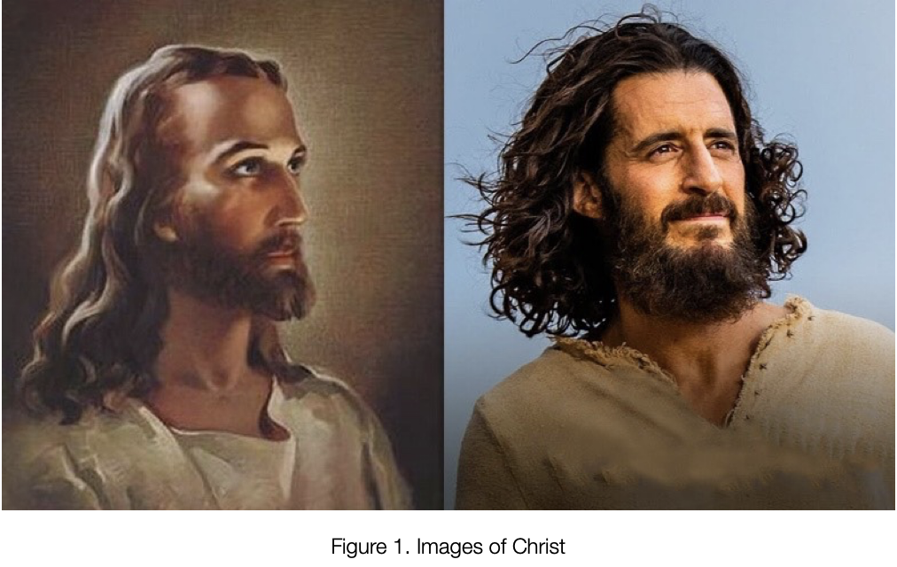
The image can change in our minds, based on our own culture and background, These two pictures are alike in many ways, but they’re also radically different. Over time, our understanding of God is built upon a variety of symbols of how God and things of the Spirit are depicted to us.
We have a natural tendency to organize and structure the visual information we perceive, in order to make sense of the world around us. As a photographer, anytime I look at something, I consciously organize it, group some things together, call one thing an object and another the subject. Subconsciously, we all do that, in order to take make sense out of chaos. This process, known as visual perception, involves the brain and its ability to interpret and categorize visual inputs. Visual perception can be organized into levels of representation ranging from concrete—like the actual cup in Figure 2—to abstract, like the line drawing of a cup at the top if Figure 2, which conveys the concept of “cup”:
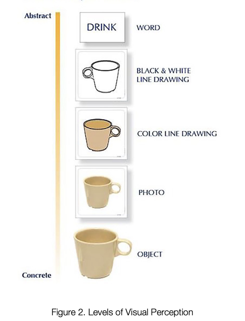
Figure 3 below has images representing things of the spirit, of religion, and of God. God’s image at top left is how God has been depicted by Christian church leaders for centuries.
[FIGURE 3 DELETED]
There are two distinct principles about visual perception. One is called semiotics, and the other is visual composition. Visual composition is a photographic way of analyzing what we see. Semiotics is human visual perception. They work together. Artists tend to be dubious of visual composition because they don’t like anything to prescribed—artists should be free to do whatever they like.
Semiotics
Semiotics is any activity involving signs. A sign is defined as anything that communicates something. A stoplight may means one thing while a red light means another. They may convey different meanings. Semiotics explores how we interpret and communicate through various forms of signs, such as words and especially images. A world without pictures would be a different world for us. Body language is a form of semiotics, the science of decoding the language of signs and understanding the ways in which we shape our understanding of the world.
The advertising industry understands this science to a tee. When you look at an advertisement, the ad agency knows exactly where your eyes will look first, second, and third, and they know exactly what they want you to feel.
With an iconic sign such as the first or second level of the representation of a cup in Figure 2, no interpretation is needed—what you see is what you see. But with an indexical sign such as smoke, what you see at one level is smoke but at another level you see fire. You don’t see the fire physically, but you see it in your “mind’s eye.” Most of us do.
It’s challenging to depict an iconic sign representing God, whom none of us, I suspect, has seen. In many religious traditions God is considered to be beyond human comprehension or representation. Most Christians share a similar picture of God but other religious cultures may not, or their God may look totally different.
God is often described as transcendent and abstract, an entity that goes beyond physical form or image. One belief is that if your God looks different from my God, both versions are correct. The belief stems from the idea that any attempt to visually depict God would be limited and insufficient because God is divine, boundless, and indescribable.
We would all accept that God is omnipotent and omnipresent—characteristics that make it harder to depicting what God looks like. Christians talk about the trinity—God as Father, Son, and Holy Ghost. God the Father is the Godhead.
Therefore, rather than relying on iconic signs, people often turn to symbolic representations, scripture, or personal experiences to connect with and understand their concept of God.
The types of semiotics are interconnected and often overlap in their understanding of signs and symbols in different contexts. Thus, they provide frameworks for understanding how meaning is generated and understood.
[FIGURE 4 DELETED]
Composition
Composition is another way in which we organize things visually. Photographic composition refers to the arrangement and organization of visual elements within our field of view. Its principles are: Simplicity, Contrast, Balence. Framing, Repetition, and Angles. These six principles can radically change the way you view your world. Someone credited with “a good eye for things” is someone who inherently knows, or has been taught, them. The more of these principles that are packed into an image, the stronger it will be.
Simplicity is nothing more than “Less is more.”
Contrast is not just light and dark. It can be rough and smooth, large and small—any contrasting attributes.
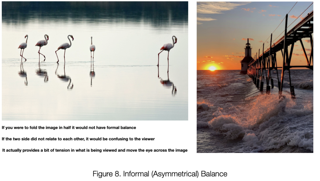
Balance is based on either the “rule of thirds” or the center. Most people center the object of a photograph, but placing it one or two-thirds of the width of the frame also works. Centeredness is very forceful. It’s forcing the viewer not to look away—“Hey, I’m talking to you.”
Framing is a very useful device to prevent the viewer’s eye from wandering outside the picture. Repetition just means what it says—repeating an object to intensify its importance.
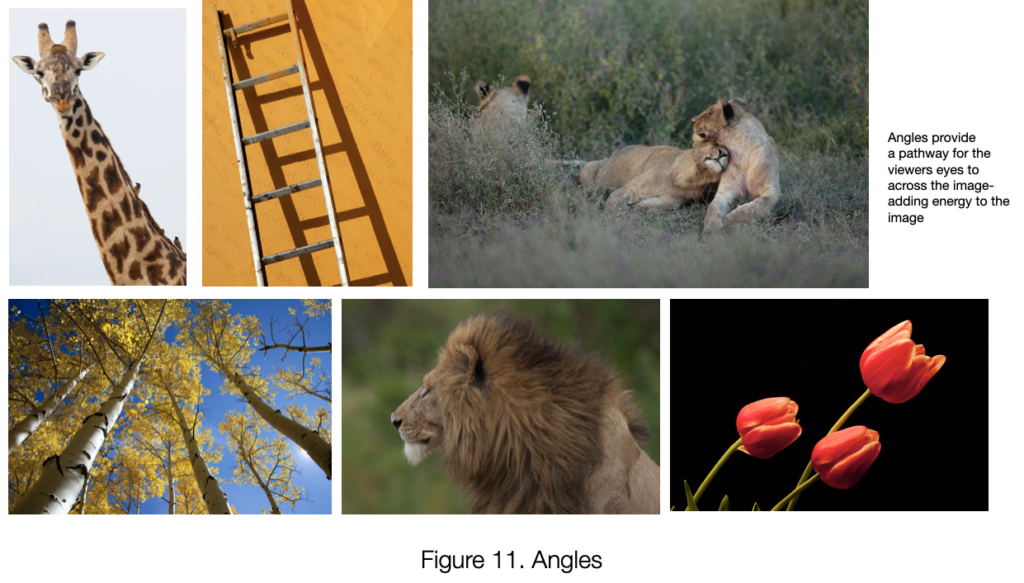
Angles: The angles at which objects are presented directs the movement of the eye.
Light vs. Dark: In a dark environment our eyes turn towards any light that is present, while in a light environment they turn to dark areas. That’s why it’s very difficult not to look at headlights.
The following Figures may help to illustrate these principles.

[FIGURE 5a DELETED]

[FIGURE 6a DELETED]

[FIGURE 7a DELETED]
[FIGURE 8a DELETED]

[FIGURE 9a DELETED]

[FIGURE 10a DELETED]
[FIGURE 11a DELETED]

[FIGURE 12a DELETED]

[FIGURE 14 DELETED]
[FIGURE 15 DELETED]
Donald: We come to understand our Maker by the images that portray Him. Subtle differences make a difference in our perception. What has shaped your understanding regarding things of the Spirit?
Don: I’m just fascinated by what I’ve learned, and in looking at the contrast between images of the Spirit I can’t help but but think of Michael’s question: Are we being deliberately fed a certain kind of line and viewpoint that has really no iconic value?
David: One also wonders about Islamic art, which is very, very symmetrical and centric. Of course, it’s revered in the Islamic world as art depicting the Spirit of God in some way, just as Christian pictures of a young bearded Christ or an old bearded God are meaningful in Christianity. They are simply using a different form of imagery to get their point across. Both forms work for their respective audiences. Muslims like the art in their mosques and Christians like the art in their churches, and we all can enjoy them both.
Donald: I think the operative term that you used in that thought is “to get their point across.” Are we careful about the point that we’re trying to get across? I would suggest that probably people aren’t doing it maliciously.
Don: I think they’re doing so almost subconsciously. I mean, what is more asymmetrical and in a certain sense unpredictable than grace? To depict a God of grace, the last thing you would do is start with a symmetrical image in bland colors. Grace is unpredictable. It’s not symmetrical. It’s certainly not bland in color.
Donald: Is it proper to humanize God? Are trying to make God a friend as opposed to our Father?
C-J: As a deity, which is removed far, far away.
Donald: I think it’s quite confusing to have a Godhead. The Holy Ghost is usually pictured as a dove and some fire—it’s quite symbolic. Christ is much more human than God is. And there is a whole bunch of images that represent the church, which are quite different from images of God, but they’re still very spiritual.
Carolyn: What really resonates with me in light of Donald’s enlightening talk is that we are made in the image of God. Therefore we have a a relationship with that image. Therefore, Jesus is at the forefront, in centerstage, while God is in the heavens—the realm above Jesus, and the Holy Spirit is within me. That’s how I see the relationship of the Trinity..
Donald: Indeed, we are made in the image of God. So God looks like us, or we look like God. We don’t all look alike but there are similarities. A small child in the arms of a gentle Jesus is different from a picture of an angry God. A violent God is a totally different image in our mind.
Is being perfect, same thing as being sinless? Was God perfect? was Christ perfect? Or was a sinless? The answer changes my picture. Jesus got angry in the temple. Is that not perfect? He still was sinless.
David: Some pictures are just still images, while others tell a story. For example, I think of Michelangelo’s image of God’s finger touching Adam’s, painted on the ceiling of the Sistine Chapel. It is supposed to be the moment God gave life to Adam, but to me it’s like the ET moment when two beings meet. If we did not know ant better, we might even conceive of it as God’s and Adam’s fingers drawing apart as Adam fell from grace. The point is there is a story in the image, whether it’s of birth, of greeting, or of separation.
Donald: However, when you start to tell a story, you can’t (from my point of view) use iconic single images that are straight in the middle. That’s not a story. Yes, there’s something being said, but it’s not allowing you to wiggle from what you’re looking at. The picture of God reaching down to the hand of man uses angles to tell the viewer where to look. The Asian lady with the one tooth suggests a story, but what is it?
That picture of the little church does not tell much of a story, but obviously, you can put multiple pictures together and tell more of a story.
Don: I feel we need a little bit more time to think about all this, so next week maybe we can prevail upon Donald to review where we are and then spend a good portion of the class discussing it and getting other people’s points of view.
Donald: I would invite everyone to Google some images and share them and critique them, to explain why we’re seeing what we’re seeing.
Michael: The contextual in a lot of these images is that God is all powerful, omnipotent, He is always higher or bigger or brighter than us. But I wonder if they end up showing God as being farther away than he really is—they end up separating us from God, which is precisely the opposite of the Michaelangelo picture where God is reaching out to bring life to mankind, to Adam.
* * *
Leave a Reply
You must be logged in to post a comment.